
See a real ResQ dashboard — no form, no wait
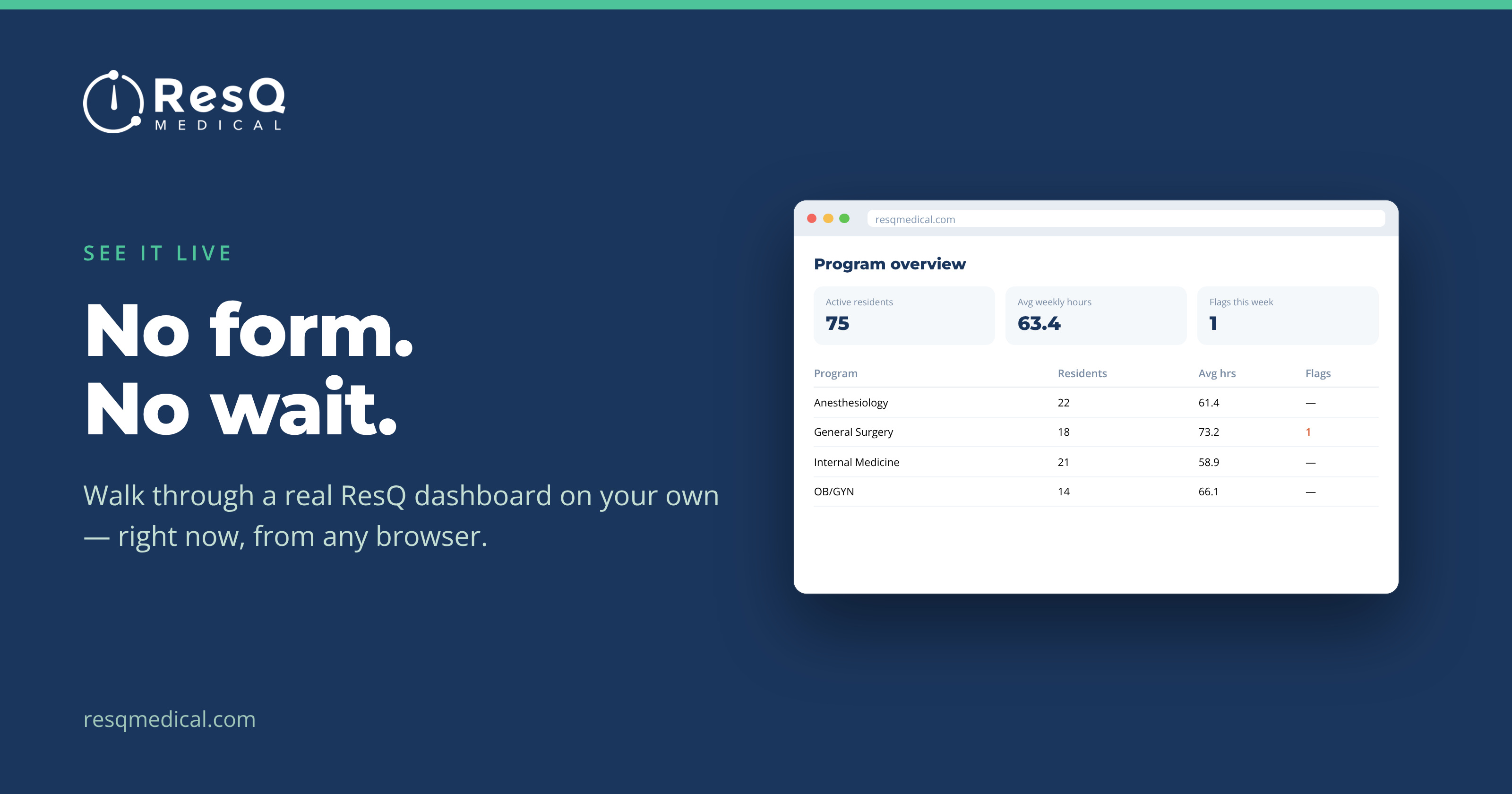
There’s a stage in evaluating any system where you don’t want a conversation. You want to look at the thing, decide in four minutes whether it’s plausible, and get on with your day. Filling in a form to be contacted by someone is a poor substitute for that.
So we built two self-guided tours you can click through right now, each filled with realistic sample data. No form, no waiting, no follow-up you didn’t ask for.
Pick the one that matches your role
- GME Office Tour — the institution-wide picture across every program, with the ability to drop into any single one, plus announcements that reach any program.
- Program Admin Tour — work-hour risk building in your own residents in time to change a schedule, with everything scoped to just the program(s) you manage.
Same underlying data in both; what differs is how much of the institution you can see. That scoping is worth seeing firsthand, because it’s usually the first question a GME office asks and the first reassurance a program director wants.
What you’ll actually click through
The tours walk the real screens, not a slideshow:
- The live dashboard — active users, hours and violations at a glance, filterable by program
- Early-warning views — residents trending toward thresholds, plus Longest Active Shifts and Longest Average Weekly Hours
- The Reports tab — pick programs and a date range, run, export
- The Weekly Summary and its Wellness Score™
- Broadcast — an announcement going out to a program, with read receipts coming back
A fair way to judge the fit
Sample data has an obvious limitation: it isn’t your program. What the tour can tell you is whether the workflow makes sense for how your office actually runs — whether the reports are cut the way you’d need them, whether the early-warning view would reach the right person, whether this is one more system or one less chase.
If the answer is promising, a 30-minute demo with your own programs as the example is the natural next step. If it isn’t, you’ve spent four minutes and no one calls you.
Four minutes, and what to look for
If you only have a moment, three screens tell you most of what you need:
- The early-warning view. This is the part that’s genuinely different from a monthly report — residents surfaced while they’re trending, not after.
- The Reports tab. Look at how the data is cut — program, PGY level, WorkZone™, individual resident, any date range — and ask whether that matches how questions arrive at your office.
- The Weekly Summary. Decide whether something landing in an inbox every week without anyone running it would actually change your habits.
There’s no login to request and nothing to install; the tours run in the browser. Send the link to a colleague who’d have to live with the thing daily — a coordinator’s four minutes on this is worth more than an hour of anyone’s pitch.